
Every website designer will be wise enough to create lists that makes his work look concise and clean to understand.
From numbered, stepped and bulleted ones to complex lists with multiple content types, there are several such types of lists. Styling them has innumerable ways. Lists make it easier for the user to grasp and speed within the conformity of the web. Hence to make more effective use of lists, there are a few principles to be kept in mind.
Maintain a hierarchy
The better the hierarchy established the more clear your list content would seem. Using a strong contextual title styled to grab the attention of the viewer with large, bold or high-contrast text. You may as well add an image to your list of relevance or variation.
Don’t create a messy mesh
This is a common mistake. Sometimes designers end up putting everything in just one tiny space. Don’t make a list look like it is a paragraph of the body text. Make sure you follow a hierarchy or just keep the visual elements in mind. White spaces can be of great use.
Don’t overuse them
Lists look beautiful, but only when used as a contrast. The more omnipresent you make it through your content; it tends to lose its distinction and seem to look over used. Use lists for summarizing or emphasize on something which is important rather having it after every few lines of content.
Five good examples of Listings:
Devia
JoyentCloud

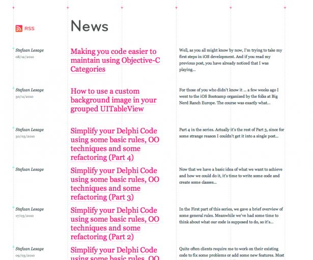
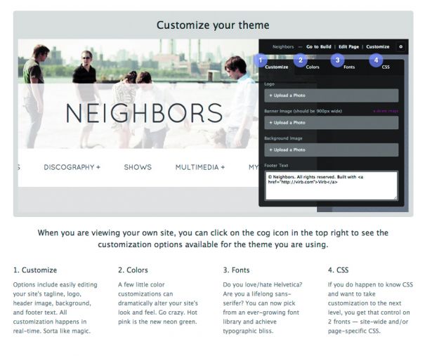
Virb
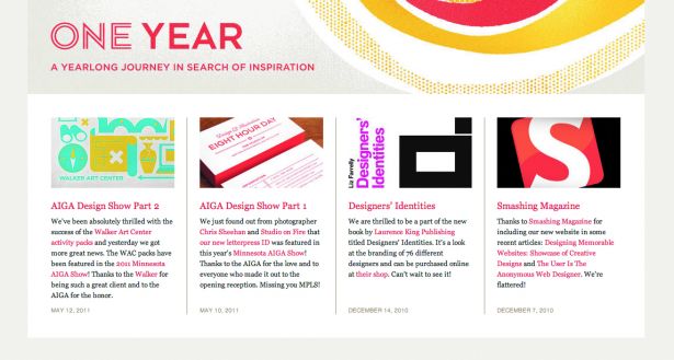
Eight Hours Day
Hey Indy