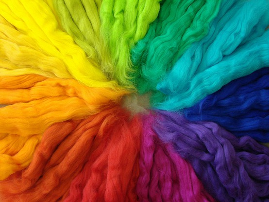
There is something about colours that makes me so jovial and vibrant. I have always loved playing around with colours, mix and match, pick the colours appropriate for a particular task I need, whatever it might be, I just love being surrounded by colours for it make my brain function instantly. If you have studied Design as a discipline, they must have taught you the importance of each colour. There is so much going on in there, a colour can display two extreme emotions like love and danger, or just the gloominess of times and of course happiness. Colours have meanings, in cultures and relationships.
What do you think of colours
You design for the web, then I am sure there is a lot going on in your head when it comes to picking the colour for your website. It s essentially important after all the world is going to be able to see what you are putting up on the web. The colours convey a message, loud enough for your work to become the word of the mouth, so studying them becomes a necessity.
For example let’s talk about making a wedding website. In the west, the common colour for the bride is to wear white for its purity and vividness. However, in a few Asian countries, white is associated with mourning. And for Chinese cultures, red is the colour of fortune, luck and love while yellow means royalty and wealth.
The meaning of the colours differ when taking cultures into consideration. You must have noticed that usually people use the colours blue and purple, and they are indeed the safest choices, as blue brings positivity, happiness and morale. But in India blue associates with gloom and in Japan it is villainous and evil. Purple on the other hand is all about the royal presence and big money bags, more like a symbol of status.
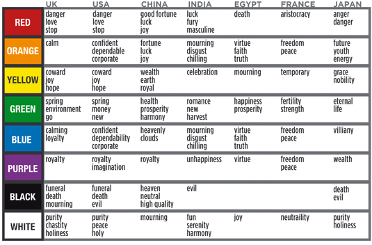
This chart could amaze you seeing countries who symbolize colours with having to lose someone they dearly loved.
Most of the times it is more about your target audience, who will see your website. I have seen many instances when designers chose to avoid the presence of colour and just lay the content, but that is not really a good idea. One, people will lose interest in a just plain looking website and two, the message you want your audience to know will simply be lost somewhere in the mid-way. It’s also wise to keep in mind that one in 12 people has colour blindness. So the colour for your photos and illustrations should be used to support the complete idea of your message and not just be the message itself. A good way to test that is to figure if the same information remains the same with absence of colour.
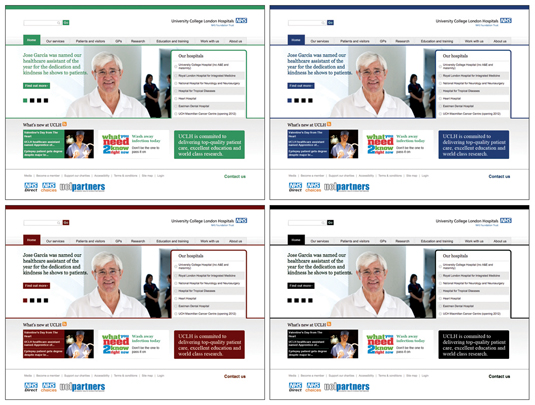
If you have ever been to a hospital, you will see the staff is dress in pastel shades, colours that would look more calming and assuring. SO the colour for your website relating to health must have shades of pastel such as green, mauve, which claims tranquillity and not excite them. It is all about the simplicity of the colours that would bring that feel to your website that you desire.
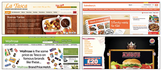
A couple example of websites that bring calm and are brightening: