Just like there is an oath book for doctors, there must be some kind of holy professional oath book for designers which says designers must design keeping their users in mind. Because if your main focus is on developing fancy attributes, technical capacities and business objectives, it is a huge mistake. The target users must be the primary focus for the designers during every occasion of developing a website.
User-centered website is designed to increase usability and usefulness at user-end. There are many ways to ensure both usability and usefulness such as the navigability of the website or how well relevant is the content for the users. The end-use is the most important, period.
Make the visibility important
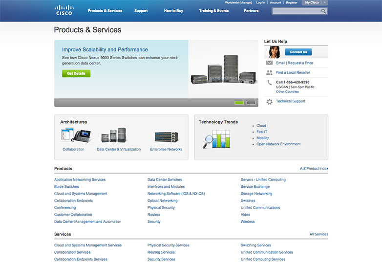
How the website looks to the user is a vital element of your design. In one glance the user can figure out what he can do and what he cannot. Hence visibility becomes the key tool to determine and predict the actions of the users.
The navigation bar of Cisco, the huge designer and manufacturer of networking equipment, is an exquisite example of perfect visibility. Irrespective of what the user sees, he will always know how to get himself jump from one section to the another.
Minimum memory load
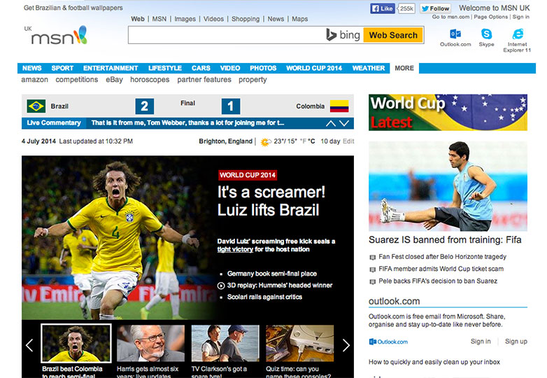
A poorly designed navigation will be as an expense to the average memory user. It is worse to compel users to remember what a sit elements mean from one page to another. To ensure that it is not much pain to the users, keep it minimal and consistent through the site.
MSN.com has understood and applied this functionality well in its website. The navigation bar remains the same on their page no matter on which section you travel.
Make feedbacks instant
Make the site user-entered with instant feedbacks. It is the simplest way to keep your user content about where they want to go for an immediate action.
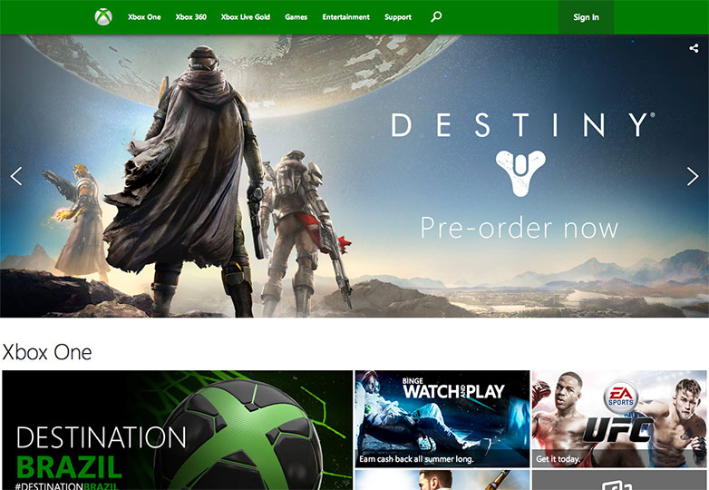
See the pre-order facility on Microsoft’s site?
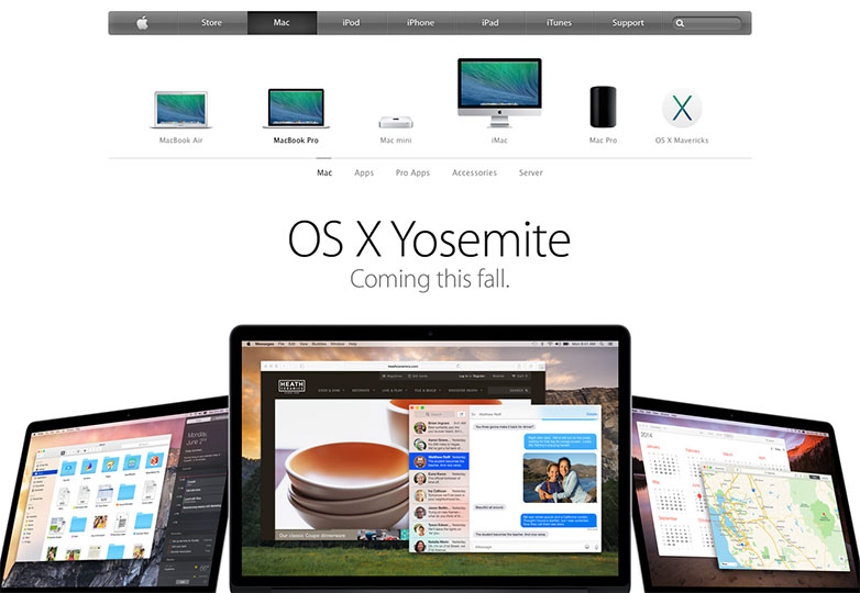
Accessibility is a priority
The users want everything to be a place to be available when they like. Accessibility becomes a very important attribute here in terms of shaping and forming up things from a very basic search feature. You can simply break your website into fragments in a structure which makes it easier for the user to simply look for what they want and not waste time unnecessarily skimming through.
This is the Apple Mac webpage, and I think it says it all.
Site Orientation is necessary
Site orientation isn’t about complexity but the lues of navigation. The most prominent examples will include site map, descriptive links and highly visible site elements that will tell the user where they are relative to other pages and how can they navigate to different pages.
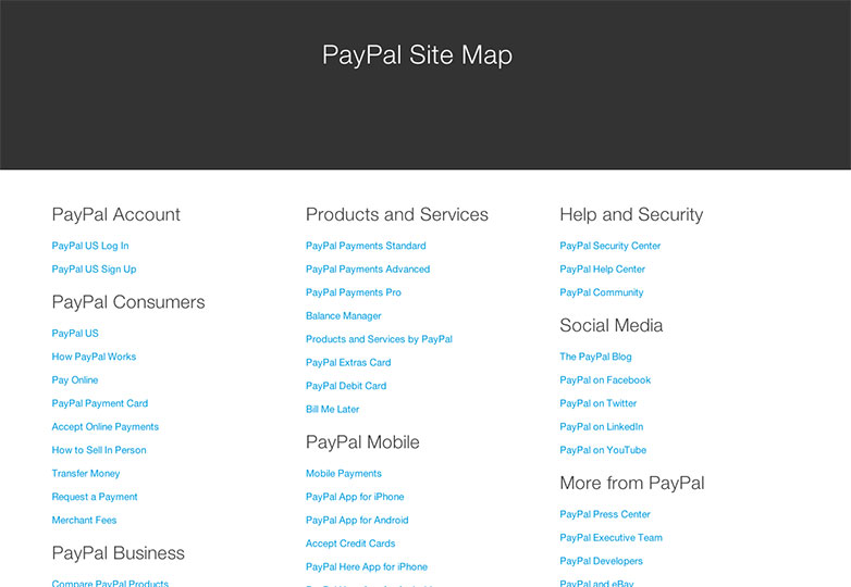
This PayPal orientation may have lot many links but for a user who ould possibly to struggle is ways to look for exactly what he wants, this site map is a great place to land.
Pleasant is how it should be
Not just about the usability, the website should equally look pleasant. The more your users like your website visually, the more they will have their faith in your content and facts. Users should be comfortable with how to use the website and feel motivated to use it.
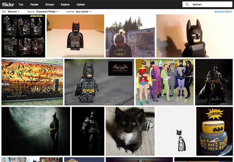
Flickr is a great example of the same.
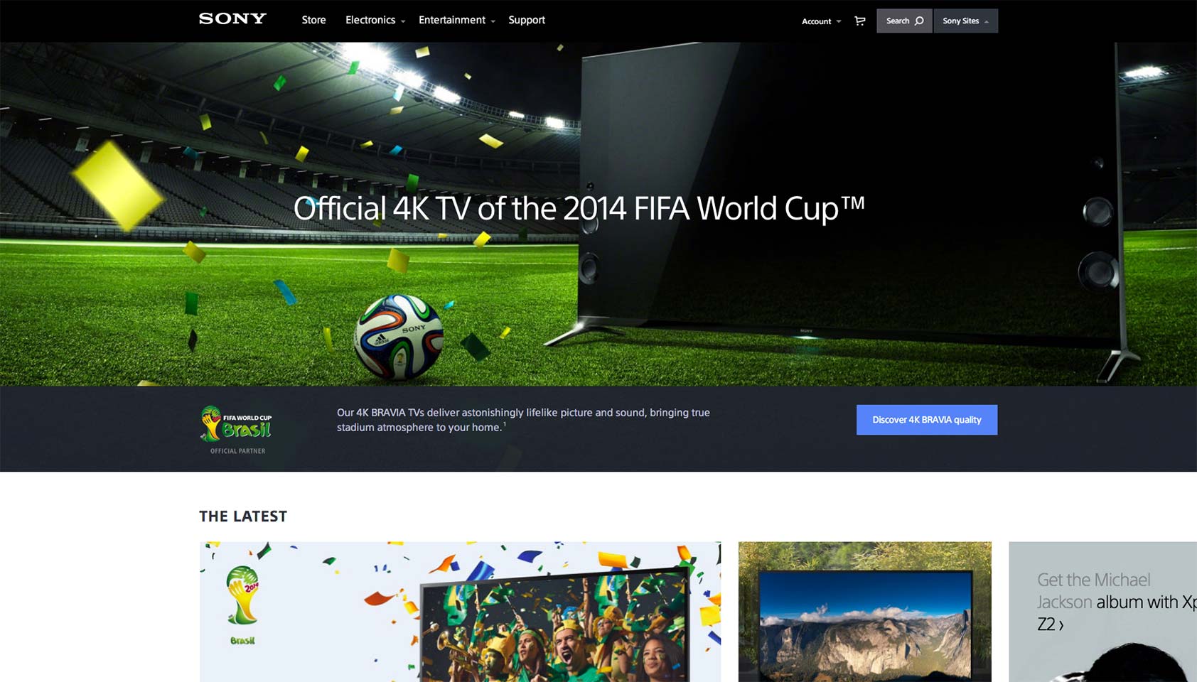
Tie it Visually
Your entire aesthetics will be tied with the visual interface. Make your website look interesting and simple with minimalistic use of colors or simple eye-catching layout.
Sony has applied this principle and brought the best out of it.