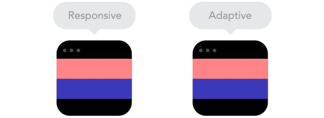
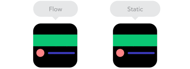
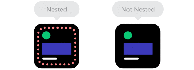
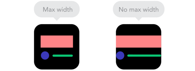
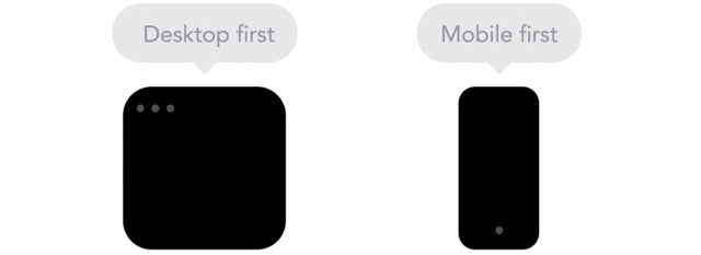
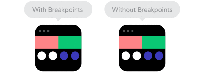
Well, in the recent past I have tried writing about what Responsive Design is but it becomes merely difficult to understand that just by reading it. Most of us have a vague knowledge about what responsive design might be even when we are using websites and application on our smartphones and desktops regularly. So just to make it easier, I found something that actually makes it easier to understand the principles, and these have been efficiently put together by the creatives at Froont, San Francisco. These are a collection of GIF’s which easily lay down the principles of understanding responsive design. Read the complete blog here to know about it in detail.
Our website uses cookies from third party services to improve your browsing experience. Read more about this and how you can control cookies by clicking "Privacy Preferences".