When it comes to digital designing, we all know how important typography is. It usually tends to play the magic wand for those designers who aspire to be successful in the long run and hence understanding the correct type is an essential need. The following ways will be what will help you how typography works, how some of them are universal while some restrict themselves to just web or any specific kinds of fonts. But nonetheless what ever I show you next will certainly let you visualize the improvisation in your boring and ineffective work patterns.
Morphology and functionality
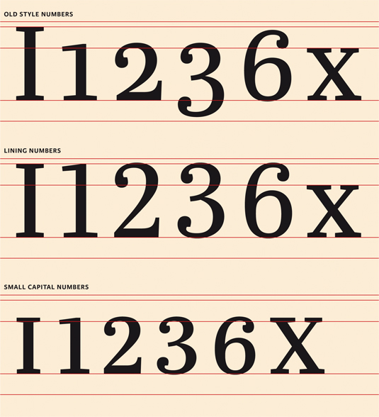
The form of a font determines its suitability for a particular role within a layout. Fonts with old-style numbers work best for body copy; lining numbers are fine for headlines.
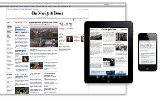
Complex designs, such as this news page, require more typefaces and type styles than simpler layouts if the information hierarchy is to be clear.
Technical Considerations
Unevenly stressed fonts (left) look hand-made; even ones machine-made.
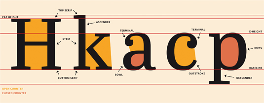
The relative proportions of a font determine its fitness as body copy.
Aesthetic Considerations
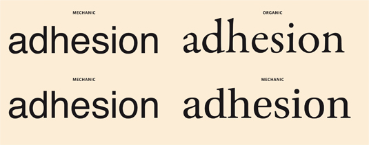
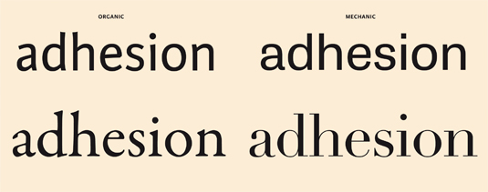
Using only organic or only mechanic fonts helps maintain typographic harmony.
Economics
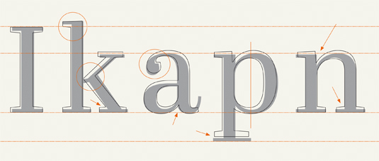
Title (grey) and text fonts (black outlines) differ in construction.
Here is a great article from Creative Bloq on how to choose the right fonts.