What is a landing page?
Suppose your company is a movie. So your landing page is the trailer of that movie. The very first impression that will build curiosity of interest in your products and your business and who you are. Those people out there who you project as your prospective clients are demanding. Being a writer what I have learnt is readers generally do not read more than a few focused seconds of your content, unless something is eye-catching interesting. It must be good enough to make a compelling case for its existence. A landing page must be minimalistic yet striking; it is a direct interaction with your customer about your product. We have some tips for your landing page conversions here that will elevate them quicker.
See What Designers Have Done Earlier
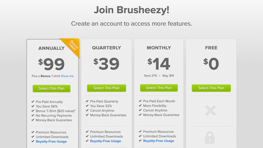
It always is great to have the call to action button right on the top of your landing page, it makes it more promising. Every detail that you lay out, make sure it is upfront, right in your customer’s face, easy to understand text (call now, contact us or the sign up text), the colors must be strong and the font must be strong and bold to convey your message. You can see the green color used by Brusheezy’s here cannot be missed.
No Mess Please.
Landing pages is all about being precise, by only showing what is necessary and that would instantly let people grasp the purpose. Keep the unnecessary elements out of the picture. The Call To Action links should be the focus which initiates action. Any other information like contacts and other info should be kept at the bottom of the page.
Color It Well
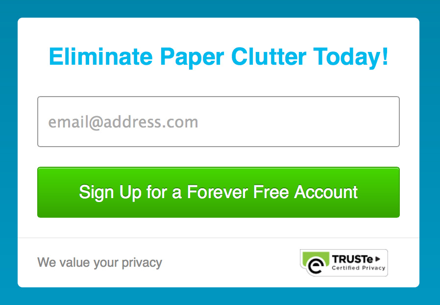
When the user looks at your page, it is the colors which his eyes notice first, which happens by default in the human neurological system. A strong bright background is good when you want to create an immediate impression for your product or business. FluidSurvey’s lovely contrasting buttons make it easy to see where to click.

The Easier You Make It, The Better It Is
Keep it easy and simple, you don’t want your users to get lost or find it tough to navigate through. An accessible and simple Call To Action button is highly recommended and is better anyway keeping things seamless. Check out Shoeboxed’s.
Test So You Know If It Would Fail
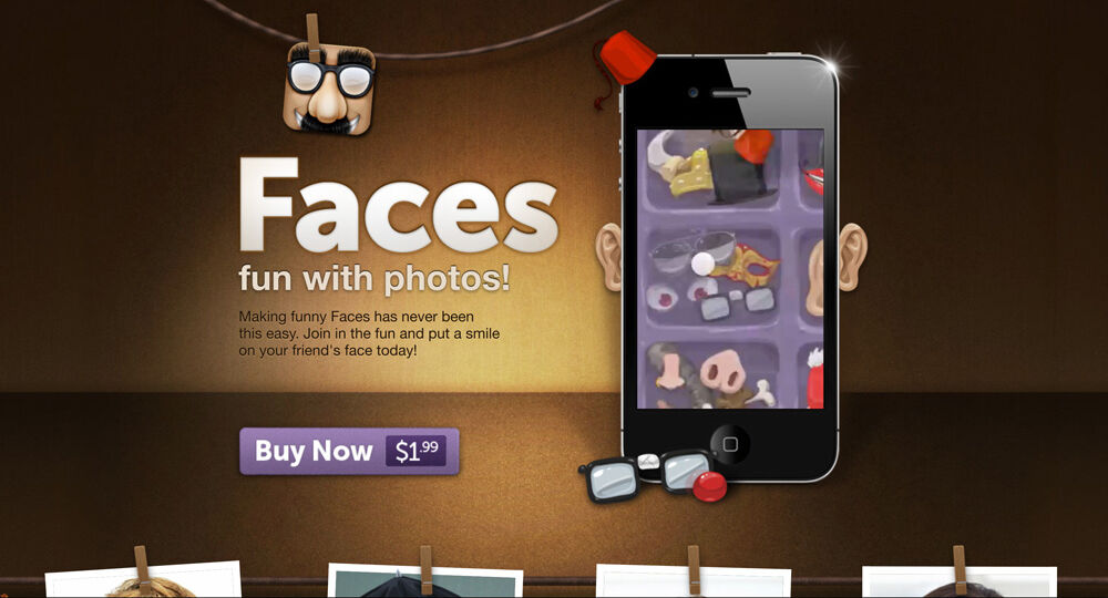
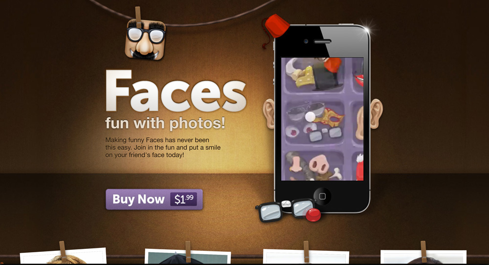
You cannot hit and try when you put something especially related to your business publicly on the web. So test your landing page, see what works for your customers than just presuming something which may or may not be right. The purple color button on Faces’ is going to be very helpful.
A landing page is not about the details of your product or services in-depth. It is all about giving a positive outlook of what your users are about to click to concede. Add a few choices and may be a short video which makes it visually great instantly.