Savannah, Georgia-based designer Ashley Comer has created satirical redesigned logos that poke fun at popular fast food chains. She loves to make a difference using art and here it is all about sarcastic effort to laugh!
In her series ‘Slow Food’, the golden arches of the McDonald’s logo gets turned into an “E” with the tagline “Eat the poor”, while the KFC logo say “FAT.”
Scroll down for what she has really done with the Fast Food Chain Logos.
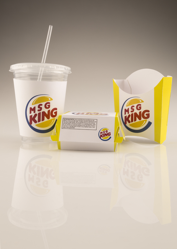
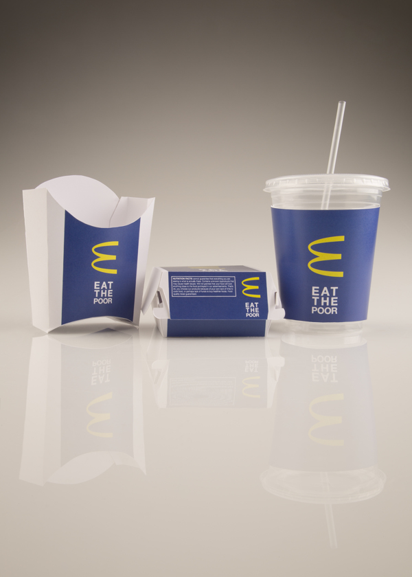
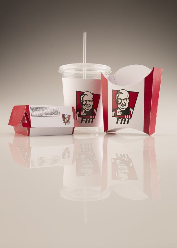
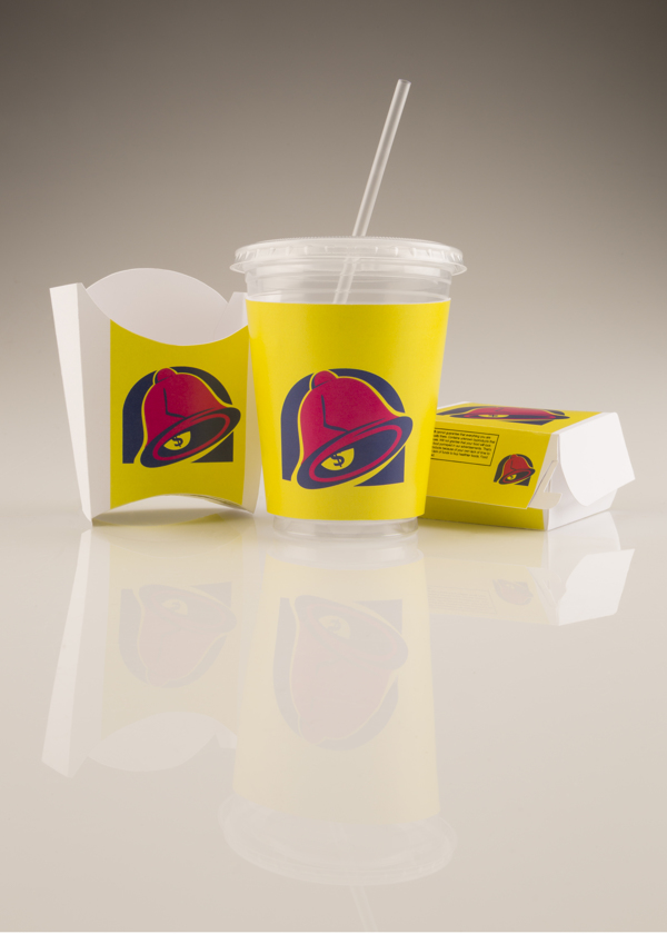
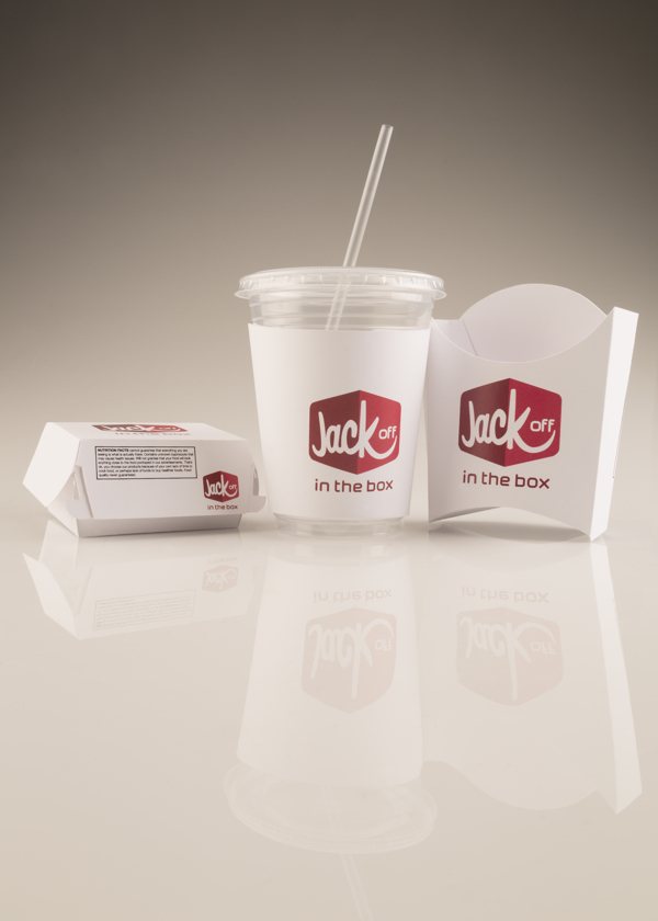
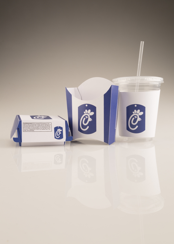
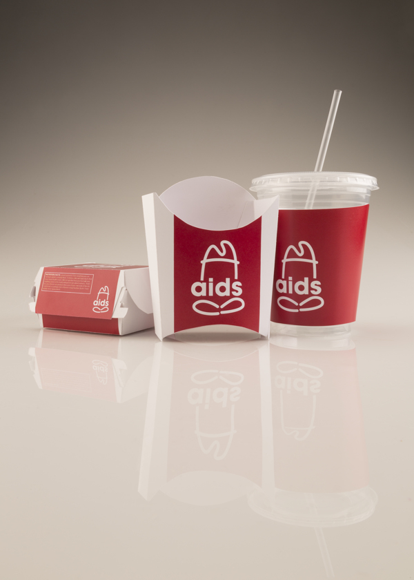
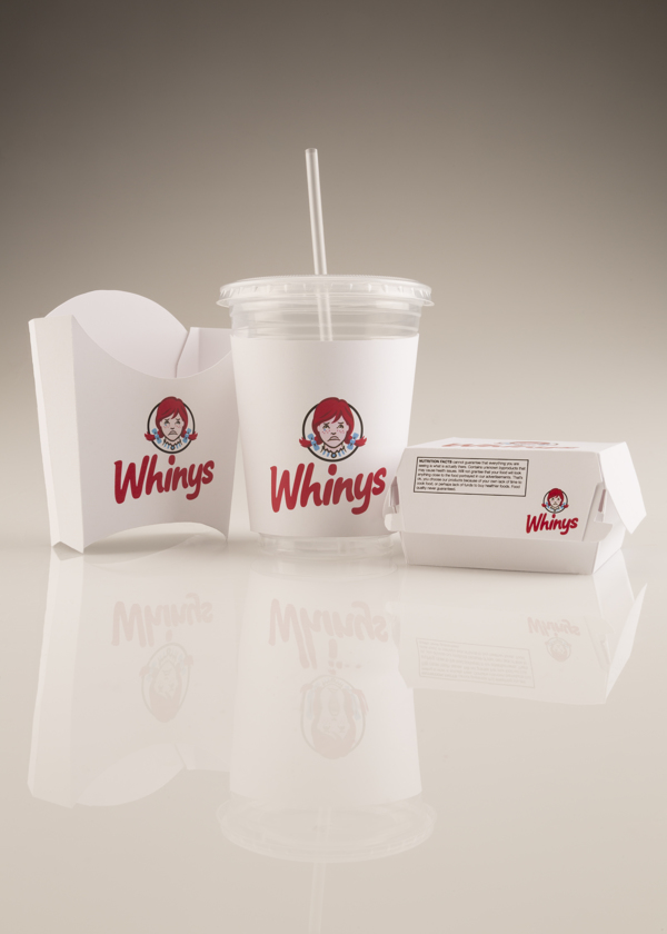
Image Courtesy: Slow Food.