Minimalism, a design decor that makes its emphasis on beng simple and removing unnecessary components of distraction, by just having the basic elements of design incorporated within, like colors, value, shapes and textures. When the internet had just begun to evolve, it was all about having more, so minimalism wasn’t very much in. However people have now slowly understood its importance and what great can it do with its simplicity. The fundamentals of minimal design in my opinion are balance, alignment and plenty of negative space, how great isn’t it? You will know a lot about the negative spacing and how great it looks. So here I am, with a few websites which has sported minimalisw really well.
Teehan Lax – Design Agency
Stripping, a design agency, and just bare basics is very tough to stand with! More you look around you will see how most of these design studios simple end up overdesigning the homepage especially, even when you don’t need it. The Teehan Lax homepage delivers. The menu is reduced to the now acceptable 3 bars motif and those buttons with just an outline stroke are subtle also effective calls to action.
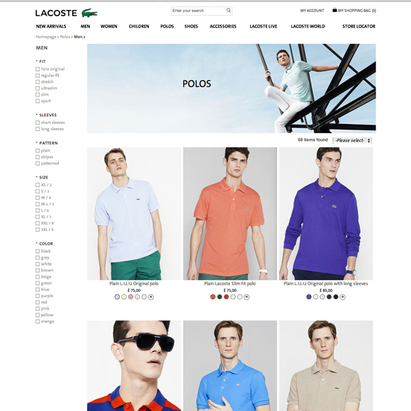
Lacoste – Sports Commerce
Ecommerce is so over-powering now a days. It is so exorbitantly overloaded unnecessaring, not to forget the homepage even here. But Lacoste is different. And if you know about it, you surely know that this bland is known for much calmer colors like white and more of the bland shades. So there is lots of white space with paired back navigation make for a tranquil online experience.
Squarespace – Large Commercial
Look at that arrangement, well if nothing, Squarespace has definitely done well on its minimalism front. They have beautiful templates here, where each one is individually designed, filling up the screen and letting its readers have a fresh air of breath around them. Squarespace sites balance large bold pictures with well-formatted type, and keeping rest everything visually pleasant, arranged and leisurely readable.
Mellbye – Architects
Something that I have learnt studying Architecture as a discipline, minimalism a core subject. Architects built a packed decorated and simple designs of cities, much before wbsites began to do it. Mellbye provides architectural services based in Oslo. You might say that the website is kind of incomplete with absence of coherent border/frame/footer in place. But there actually is a very intelligent use of white spacing in here.
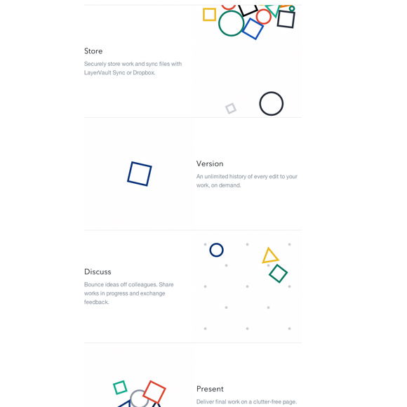
Layervault – UK Startup
You’re a startup and you’re going all minimalistic, well what can I say then, bravest of all! If not done in the wisest way, downfall is coming. For Layervault it indeed worked, as the entire ethos of the company is ‘Simple version control for designers.’ A more chaotic design would have been contradictory to what this start-up actually aims to. The animations are simple and clear, involving moving lines with primary colours to add a touch of interest, the homepage is shining in white spaces. The grey dividing lines have been used as borders between sections and the white space between columns are spaced evenly to create serenity.


